Oklahoma Math A1.D.1
Standard Cluster
Display, describe, and compare data. For linear relationships, make predictions, and assess the reliability of those predictions. Display, describe, and compare data sets using summary statistics (central tendency and spread (range)). Utilize technology (e.g., spreadsheets, calculators) to display data and calculate summary statistics. Collect data and analyze scatter plots for patterns, linearity, and outliers. Make predictions based upon the linear regression, and use the correlation coefficient to assess the reliability of those predictions using graphing technology.
Oklahoma Academic Standards for Mathematics (2022)
Cluster contents
Standards in This Cluster
A1.D.1 is a cluster heading. These are the individual standards under it.
- A1.D.1.1
Display, describe, and compare data sets using summary statistics (central tendency and spread (range)). Utilize technology (e.g., spreadsheets, calculators) to...
- A1.D.1.2
Collect data and analyze scatter plots for patterns, linearity, and outliers.
- A1.D.1.3
Make predictions based upon the linear regression, and use the correlation coefficient to assess the reliability of those predictions using graphing technology.
Teacher's field guide
What This Cluster Means
What Students Need to Do
- Students use spreadsheets or calculators to graph data and compare sets using mean, median, and range. They collect paired measurements and look for straight-line patterns and outliers. They use a regression line to make predictions and judge how reliable those predictions are.
What Mastery Looks Like
- Students make clear graphs and explain how two data sets differ in center and spread. They spot outliers, fit a line, and use the correlation coefficient and the measured range to judge a prediction.
Common Misconceptions
- Students may think equal means imply equal spread. They may ignore an outlier when fitting a line. They may think a strong correlation makes predictions far beyond the measured values safe.
How to Assess It
- Plot (1,2), (2,3), (3,5), (4,6), and (5,8) on a graphing calculator and run linear regression. Find the mean and range of the y-values, predict y at x=6 and x=20, and use the correlation coefficient and measured range to explain which prediction is safer.
Lesson moves
Ways to Teach It
Measure ten classmates' arm spans and heights, enter the pairs in a spreadsheet, and flag points far from the pattern.
Show two scatter plots with the same slope but different scatter; ask which gives a safer prediction at x=7 and why.
Give teams two six-number data sets to graph; have them calculate each mean, median, and range in a spreadsheet, then compare the sets.
Plot a weather app's hourly temperatures from 8 a.m. to noon, predict 1 p.m. with a fitted line, then check the forecast.
Free download
Printable A1.D.1 Worksheet
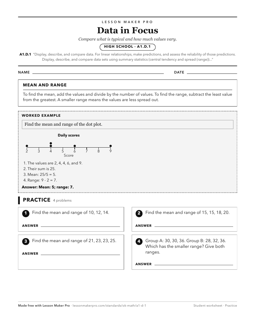
A ready-to-print activity worksheet aligned to A1.D.1, with an answer key for the teacher on its own page. No account needed.
PDF, US Letter, prints cleanly in black and white.
Download the worksheetKeep exploring
Related Standards
- A2.D.1
Display, describe, and compare data. For linear and nonlinear relationships, make predictions and assess the reliability of those predictions.
- PA.D.1
Display and interpret data in a variety of ways, including using scatter plots and approximate lines of best fit. Use the line of best fit and average rate of c...
- A2.D.1.2
Collect data and use scatter plots to analyze patterns and describe linear, exponential, or quadratic relationships between two variables.
- PA.A.2.2
Identify, describe, and analyze linear relationships between two variables.
Turn this cluster into a lesson
Grade, subject, topic, and the complete cluster are prefilled. Create one free, no account needed.
Also for this cluster:Make a WorksheetMake a QuizMake a Sub Lesson