Florida B.E.S.T. MA.6.DP.1.4
The Standard
Given a histogram or line plot within a real-world context, qualitatively describe and interpret the spread and distribution of the data, including any symmetry, skewness, gaps, clusters, outliers and the range.
Florida B.E.S.T. Standards for Mathematics
Teacher's field guide
What This Standard Means
What Students Need to Do
- Students read a histogram or line plot and describe the overall shape and spread using evidence from the graph. They connect clusters, gaps, outliers, and range to the real-world situation.
What Mastery Looks Like
- Students correctly identify the distribution as symmetric or skewed and point out meaningful gaps, clusters, and outliers. They find the range from the data values and support each claim with evidence from the graph.
Common Misconceptions
- Students may call the tallest bar an outlier or use frequencies to calculate the range. They may name skew by the cluster rather than the longer tail, or mistake a low frequency for a gap.
How to Assess It
- Display a line plot for 10, 11, 11, 12, 12, 12, 13, 14, and 20 minutes. Ask students to describe its shape, cluster, gap, outlier, and range in context.
Lesson moves
Ways to Teach It
Give students value cards and build a human line plot, then place labeled cards for the cluster, gap, outlier, and range.
Project two histograms and ask, "Which group is more spread out, and what features in the graphs support your claim?"
Play feature hunt with graph cards, earning one point for each correctly identified shape, cluster, gap, outlier, and range.
Graph class commute times, then write two sentences explaining the typical pattern and any unusual values in the class data.
Free download
Printable MA.6.DP.1.4 Worksheet
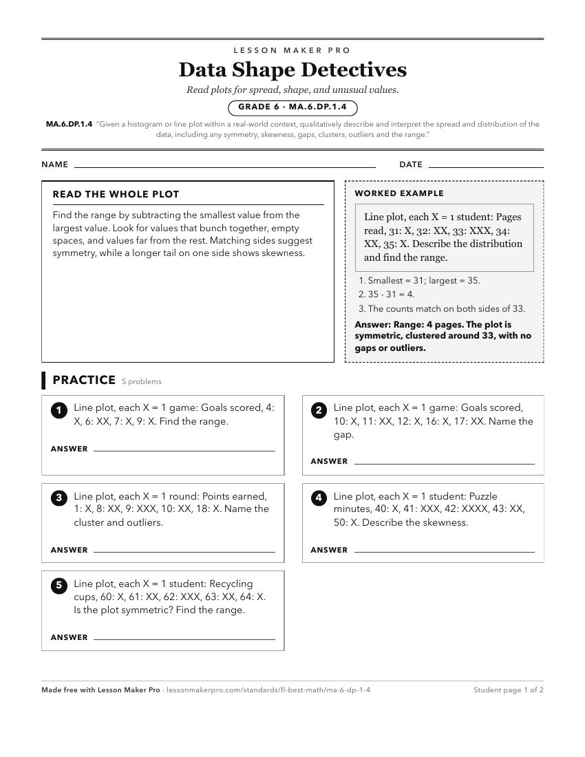
A ready-to-print activity worksheet aligned to MA.6.DP.1.4, with an answer key for the teacher on its own page. No account needed.
PDF, US Letter, prints cleanly in black and white.
Download the worksheetKeep exploring
Related Standards
- MA.912.DP.1.2
Interpret data distributions represented in various ways. State whether the data is numerical or categorical, whether it is univariate or bivariate and interpre...
- MA.8.DP.1.2
Given a scatter plot within a real-world context, describe patterns of association.
- MA.6.DP.1.3
Given a box plot within a real-world context, determine the minimum, the lower quartile, the median, the upper quartile and the maximum. Use this summary of the...
- MA.6.DP.1.5
Create box plots and histograms to represent sets of numerical data within real-world contexts.
Turn this exact standard into a lesson
Grade, subject, topic, and the complete standard are prefilled. Create one free, no account needed.
Also for this standard:Make a WorksheetMake a QuizMake a Sub Lesson