TEKS Math 6.12.D
The Standard
summarize categorical data with numerical and graphical summaries, including the mode, the percent of values in each category (relative frequency table), and the percent bar graph, and use these summaries to describe the data distribution
Texas Essential Knowledge and Skills for Mathematics
Teacher's field guide
What This Standard Means
What Students Need to Do
- Students organize category counts and identify the category that occurs most often. They convert each count to a percentage of the total and show the shares in a bar divided into 100%. They use the table and graph to compare category sizes and describe patterns.
What Mastery Looks Like
- Given category counts, a student names the most common category, calculates accurate percentages, and makes a correctly scaled percent bar graph. The percentages total 100%, and the student supports comparisons with values from the table or graph.
Common Misconceptions
- Students may give the largest count instead of naming its category as the mode. They may divide by the number of categories instead of the total responses. Their percentages or graph sections may not total 100%.
How to Assess It
- Give these survey results: dogs 8, cats 6, fish 4, birds 2. Ask students to find the mode, calculate each percentage, draw a percent bar graph, and write two comparisons.
Lesson moves
Ways to Teach It
Give groups 30 colored tiles; students sort them, count each color, calculate percentages, and build a 100-square display matching the results.
Show two percent bar graphs and ask, “Which category dominates each set, and what evidence supports your claim?”
Play Category Match: students pair data cards with relative frequency tables, modes, and percent bar graphs, then explain each match.
Survey class lunch choices, calculate each option's percentage, graph the results, and write one sentence for the cafeteria manager.
Free download
Printable 6.12.D Worksheet
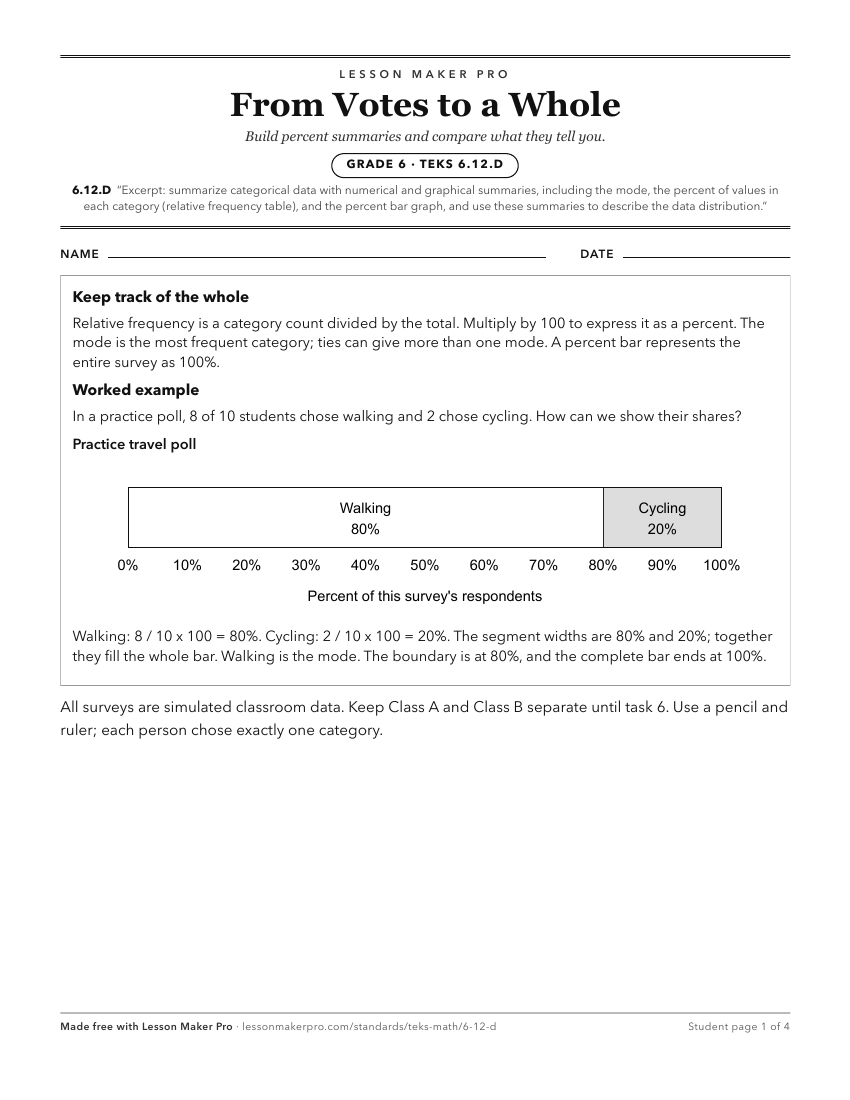
A ready-to-print activity worksheet aligned to 6.12.D, with an answer key for the teacher on its own page. No account needed.
PDF, US Letter, prints cleanly in black and white.
Download the worksheetKeep exploring
Related Standards
- 6.12.B
use the graphical representation of numeric data to describe the center, spread, and shape of the data distribution
- 5.9.A
represent categorical data with bar graphs or frequency tables and numerical data, including data sets of measurements in fractions or decimals, with dot plots ...
- 6.12.C
summarize numeric data with numerical summaries, including the mean and median (measures of center) and the range and interquartile range (IQR) (measures of spr...
- 3.8.A
summarize a data set with multiple categories using a frequency table, dot plot, pictograph, or bar graph with scaled intervals
Turn this exact standard into a lesson
Grade, subject, topic, and the complete standard are prefilled. Create one free, no account needed.
Also for this standard:Make a WorksheetMake a QuizMake a Sub Lesson