TEKS Math 6.12.C
The Standard
summarize numeric data with numerical summaries, including the mean and median (measures of center) and the range and interquartile range (IQR) (measures of spread), and use these summaries to describe the center, spread, and shape of the data distribution
Texas Essential Knowledge and Skills for Mathematics
Teacher's field guide
What This Standard Means
What Students Need to Do
- Students order a data set and calculate several values that show what is typical and how much the data varies. They compare the mean and median, then compare the range and IQR. They use those results with a graph to describe balance, clustering, skew, or extreme values.
What Mastery Looks Like
- Given a data set and a dot plot, a student accurately finds all four summaries. The student identifies a typical value, compares overall and middle spread, and explains any skew or extreme value.
Common Misconceptions
- Students may find the median before ordering the values or divide the sum by the wrong number of values. They often confuse IQR with range or subtract the wrong quartiles. They may trust the mean even when one extreme value pulls it away from most of the data.
How to Assess It
- Give students the data set 2, 3, 4, 5, 6, 10. Ask them to find the mean, median, range, and IQR, then describe the center, spread, and shape in one sentence.
Lesson moves
Ways to Teach It
Have students place data cards on a floor number line, then mark the mean, median, quartiles, range, and IQR with colored tape.
Show two dot plots with equal means but different spreads, and ask, "Which group is more consistent, and what evidence proves it?"
Play Summary Match: teams pair data sets, box plots, and cards listing mean, median, range, and IQR.
Use class commute times to compare a typical trip, variability, and the effect of one unusually long commute.
Free download
Printable 6.12.C Worksheet
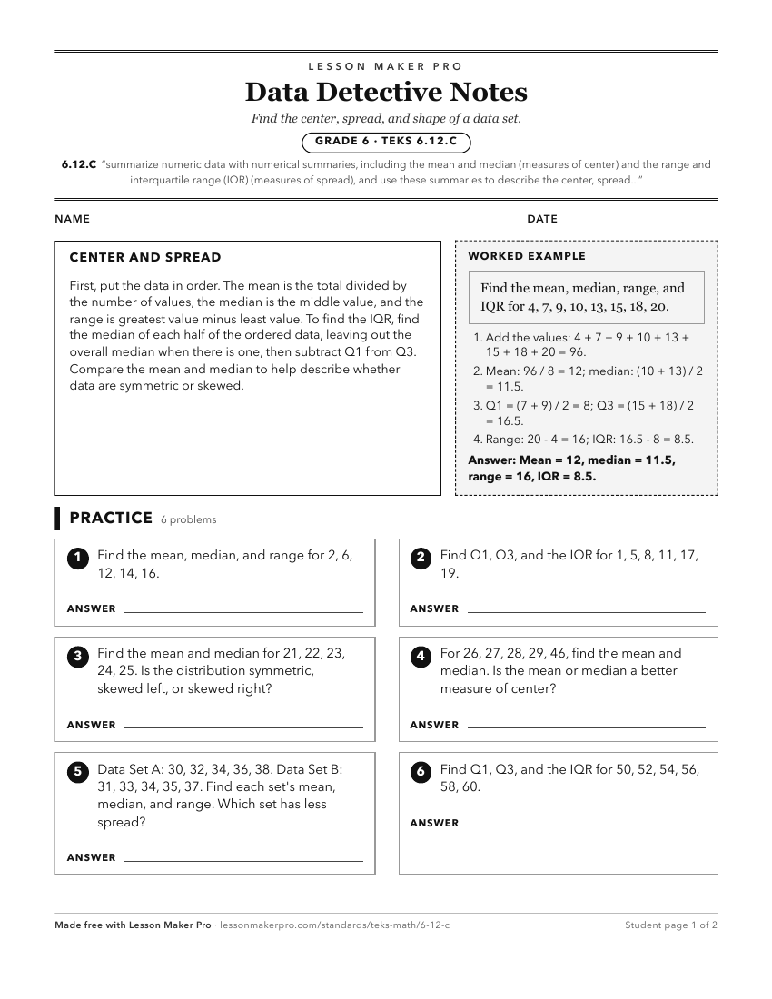
A ready-to-print activity worksheet aligned to 6.12.C, with an answer key for the teacher on its own page. No account needed.
PDF, US Letter, prints cleanly in black and white.
Download the worksheetKeep exploring
Related Standards
- 6.12.B
use the graphical representation of numeric data to describe the center, spread, and shape of the data distribution
- 6.12.D
summarize categorical data with numerical and graphical summaries, including the mode, the percent of values in each category (relative frequency table), and th...
- 6.12.A
represent numeric data graphically, including dot plots, stem-and-leaf plots, histograms, and box plots
- 6.13.A
interpret numeric data summarized in dot plots, stem-and-leaf plots, histograms, and box plots
Turn this exact standard into a lesson
Grade, subject, topic, and the complete standard are prefilled. Create one free, no account needed.
Also for this standard:Make a WorksheetMake a QuizMake a Sub Lesson