Alabama Math GDA.DSP.C
Standard Cluster
Distributions of quantitative data (continuous or discrete) in one variable should be described in the context of the data with respect to what is typical (the shape, with appropriate measures of center and variability, including standard deviation) and what is not (outliers), and these characteristics can be used to compare two or more subgroups with respect to a variable.
2019 Alabama Course of Study: Mathematics · Geometry with Data Analysis
Cluster contents
Standards in This Cluster
GDA.DSP.C is a cluster heading. These are the individual standards under it.
- GDA.DSP.C.9
Represent the distribution of univariate quantitative data with plots on the real number line, choosing a format (dot plot, histogram, or box plot) most appropr...
- GDA.DSP.C.10.a
Explain how standard deviation develops from mean absolute deviation.
- GDA.DSP.C.10.b
Calculate the standard deviation for a data set, using technology where appropriate.
- GDA.DSP.C.11
Interpret differences in shape, center, and spread in the context of data sets, accounting for possible effects of extreme data points (outliers) on mean and st...
Teacher's field guide
What This Cluster Means
What Students Need to Do
- Students describe the shape, center, spread, and outliers of numerical data in context. They use mean and standard deviation for roughly symmetric data, or median and interquartile range for skewed data, then compare groups.
What Mastery Looks Like
- Given commute times for two groups, students use plots and numbers to say which group has a longer typical trip and which varies more. They identify an unusually long trip and explain how it affects the mean.
Common Misconceptions
- Students may mistake the tallest bar on a histogram for the mean. They may treat an outlier as typical, or compare two groups without checking whether a few extreme values pull the mean.
How to Assess It
- Exit ticket: Bus times are 8, 9, 10, 11, 12 minutes. Walk times are 5, 6, 7, 8, 24 minutes. Sketch dot plots, identify the outlier, and compare typical time and spread using suitable measures.
Lesson moves
Ways to Teach It
Use counters to build dot plots for bus times 8, 9, 10, 11, 12 and walk times 5, 6, 7, 8, 24.
Ask: Does 24 minutes describe a typical walk? Why does it pull the mean more than the median?
Show printed symmetric and skewed dot plots; award a point when teams choose suitable center and spread measures and explain why.
Print two weeks of daily high temperatures from a weather site; compare their typical temperatures, spread, and unusual days.
Free download
Printable GDA.DSP.C Worksheet
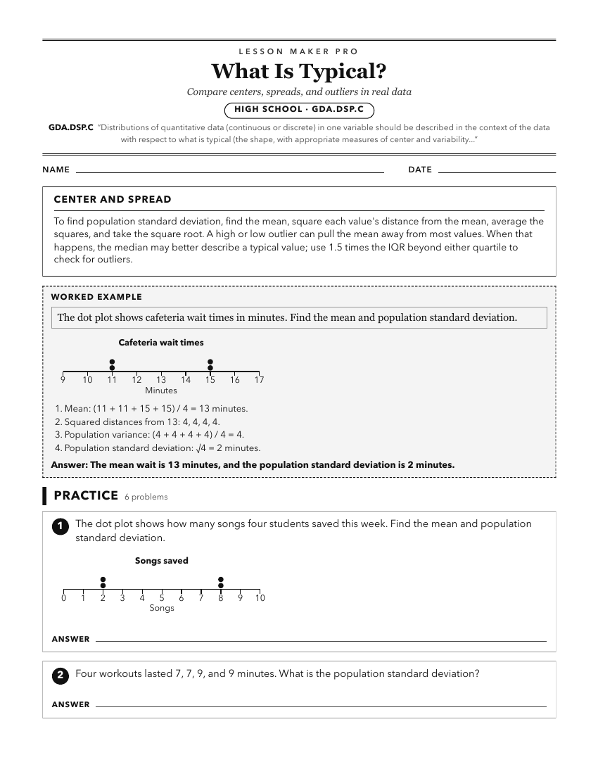
A ready-to-print activity worksheet aligned to GDA.DSP.C, with an answer key for the teacher on its own page. No account needed.
PDF, US Letter, prints cleanly in black and white.
Download the worksheetKeep exploring
Related Standards
- A2S.DSP.C
Distributions of quantitative data (continuous or discrete) in one variable should be described in the context of the data with respect to what is typical (the ...
- 6.DSP.A.24.a
Analyze the graphical representation of data by describing the center, spread, shape (including approximately symmetric or skewed), and unusual features (includ...
Turn this cluster into a lesson
Grade, subject, topic, and the complete cluster are prefilled. Create one free, no account needed.
Also for this cluster:Make a WorksheetMake a QuizMake a Sub Lesson