Virginia SOL 8.PS.2.i
The Standard
Given a contextual situation, justify which graphical representation (e.g., pictographs, bar graphs, line graphs, line plots/dot plots, stem-and-leaf plots, circle graphs, histograms, and boxplots) best represents the data.
Virginia Standards of Learning for Mathematics · The student will apply the data cycle (formulate questions; collect or acquire data; organize and represent data; and analyze data and communicate results) with a focus on boxplots.
Teacher's field guide
What This Standard Means
What Students Need to Do
- Students examine the data type, the question being asked, and the features readers need to compare. They choose an appropriate graph and explain why it communicates the data better than other options.
What Mastery Looks Like
- Given a context and data set, students select a graph suited to categorical, numerical, time-based, or part-to-whole data. They justify the choice using distribution, change over time, median, spread, frequency, or proportion.
Common Misconceptions
- Students often choose graphs by appearance rather than purpose. They may use a line graph for unrelated categories, treat histogram intervals as categories, or choose a circle graph when values are not parts of one whole. They may choose a boxplot when exact values or frequencies must be visible.
How to Assess It
- Exit ticket: “A coach wants to compare the distributions of mile times for two teams. Choose a graph and explain why it is better than a line graph and a circle graph.”
Lesson moves
Ways to Teach It
Give pairs one data set and graph-type cards; have them sort cards into useful, possible, and misleading, then defend each placement.
Ask students to write: Which graph best shows changes in monthly rainfall, and what would be harder to see in another graph?
Run Graph Match: teams pair six context cards with graph cards, earning a point when their justification names the data and purpose.
Use cafeteria survey results to choose a display for meal preferences, then explain how that display would help the manager order food.
Free download
Printable 8.PS.2.i Worksheet
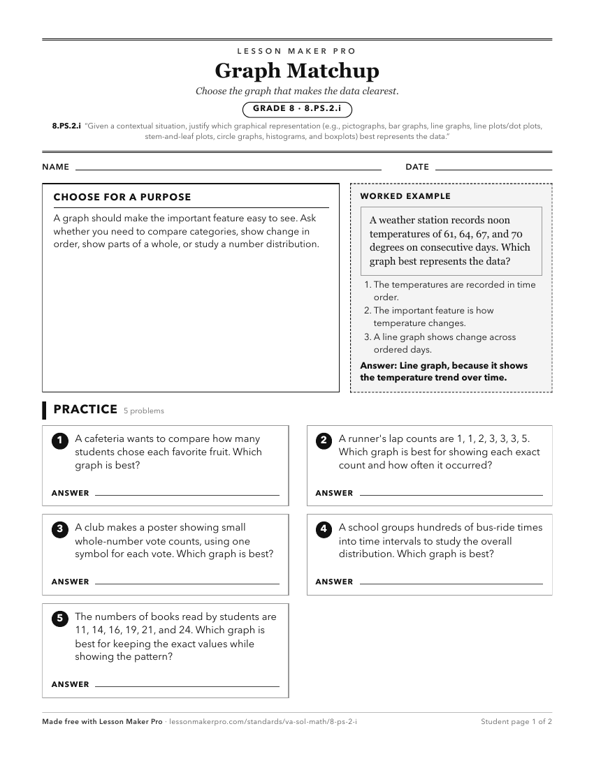
A ready-to-print activity worksheet aligned to 8.PS.2.i, with an answer key for the teacher on its own page. No account needed.
PDF, US Letter, prints cleanly in black and white.
Download the worksheetKeep exploring
Related Standards
- 7.PS.2.f
Compare data represented in histograms with the same data represented in other graphs, including but not limited to line plots (dot plots), circle graphs, and s...
- 3.PS.1.d
Organize and represent a data set using bar graphs with a title and labeled axes, with and without the use of technology tools. Determine and use an appropriate...
- 2.PS.1.c
Organize and represent a data set using a pictograph where each symbol represents up to 2 data points. Determine and use a key to assist in the analysis of the ...
- 6.PS.1.f
Compare data represented in a circle graph with the same data represented in other graphs, including but not limited to bar graphs, pictographs, and line plots ...
Turn this exact standard into a lesson
Grade, subject, topic, and the complete standard are prefilled. Create one free, no account needed.
Also for this standard:Make a WorksheetMake a QuizMake a Sub Lesson