CCSS.
The Standard
Interpret differences in shape, center, and spread in the context of the data sets, accounting for possible effects of extreme data points (outliers).
Common Core State Standards for Mathematics
Teacher's field guide
What This Standard Means
What Students Need to Do
- Students compare quantitative data sets by examining typical values, variability, symmetry, and skew. They connect those differences to the situation and explain how unusual values may change the results.
What Mastery Looks Like
- Given dot plots, histograms, or box plots, students accurately compare typical values, variability, symmetry, and skew. They explain how an extreme value affects the mean, median, range, and overall interpretation in context.
Common Misconceptions
- Students may describe only the highest and lowest values instead of the overall distribution. They may assume an outlier always changes the median or that greater spread means a greater center. Some compare graphs without using the data’s context or units.
How to Assess It
- Exit ticket: Commute times are A: 8, 9, 9, 10, 10, 11, 11, 12 and B: 8, 9, 9, 10, 10, 11, 11, 30 minutes. Compare their shape, center, and spread, then explain how 30 affects each measure.
Lesson moves
Ways to Teach It
Use sticky notes to build two class dot plots, then move one note far right and record which features change.
Show two histograms of test scores and ask, “Which class was more consistent, and what evidence supports your claim?”
Run a card sort matching data displays with statements about center, spread, skew, and outlier effects.
Compare player salaries from two sports teams, then explain why the mean and median may tell different stories.
Free download
Printable HSS-ID.A.3 Worksheet
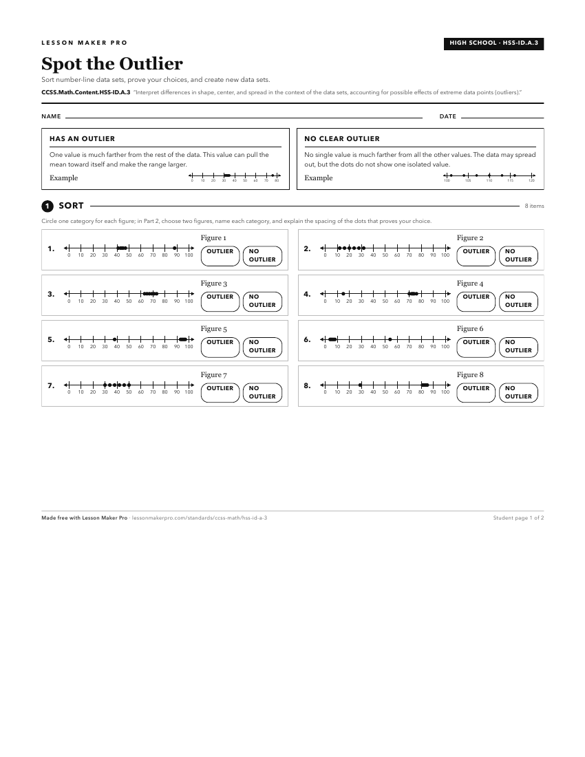
A ready-to-print activity worksheet aligned to CCSS.Math.Content.HSS-ID.A.3, with an answer key for the teacher on its own page. No account needed.
PDF, US Letter, prints cleanly in black and white.
Download the worksheetLearning progression
Where This Standard Sits
Before This Standard
If students are struggling here, check these first.
- CCSS.Math.Content.HSS-ID.A.1
Making dot plots, histograms, and box plots supports comparing shape, center, spread, and spotting outliers in context.
- CCSS.Math.Content.HSS-ID.A.2
Choosing and comparing mean, median, IQR, and standard deviation is needed to explain distribution differences and outlier effects in context.
- CCSS.Math.Content.7.SP.B.4
Using center and variability to compare groups prepares students to interpret center, spread, shape, and outlier effects in data contexts.
What This Unlocks
Mastery here sets students up for these next.
Keep exploring
Related Standards
- CCSS.Math.Content.6.SP.B.5d
Relating the choice of measures of center and variability to the shape of the data distribution and the context in which the data were gathered.
- CCSS.Math.Content.6.SP.B.5c
Giving quantitative measures of center (median and/or mean) and variability (interquartile range and/or mean absolute deviation), as well as describing any over...
- CCSS.Math.Content.6.SP.A.2
Understand that a set of data collected to answer a statistical question has a distribution which can be described by its center, spread, and overall shape.
Turn this exact standard into a lesson
Grade, subject, topic, and the complete standard are prefilled. Create one free, no account needed.
Also for this standard:Make a WorksheetMake a QuizMake a Sub Lesson